

May 28 to June 3, 2026
Pick which contacts to add to Conmigo
Choose the people you want from your phone contacts. Plus clearer sharing screens and a wider profile panel on computers.
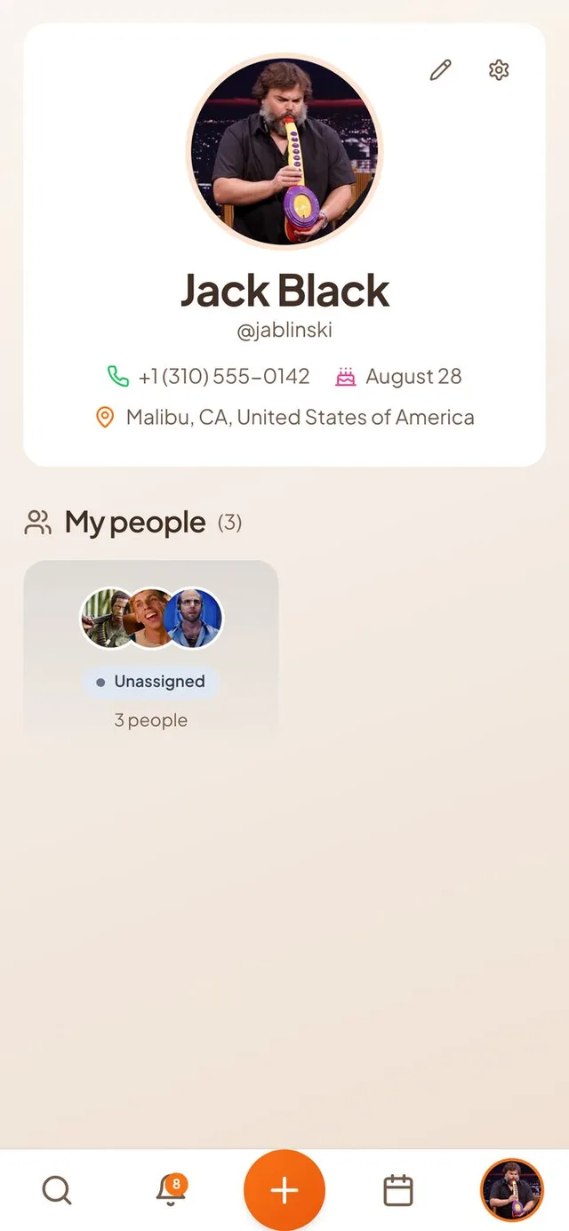
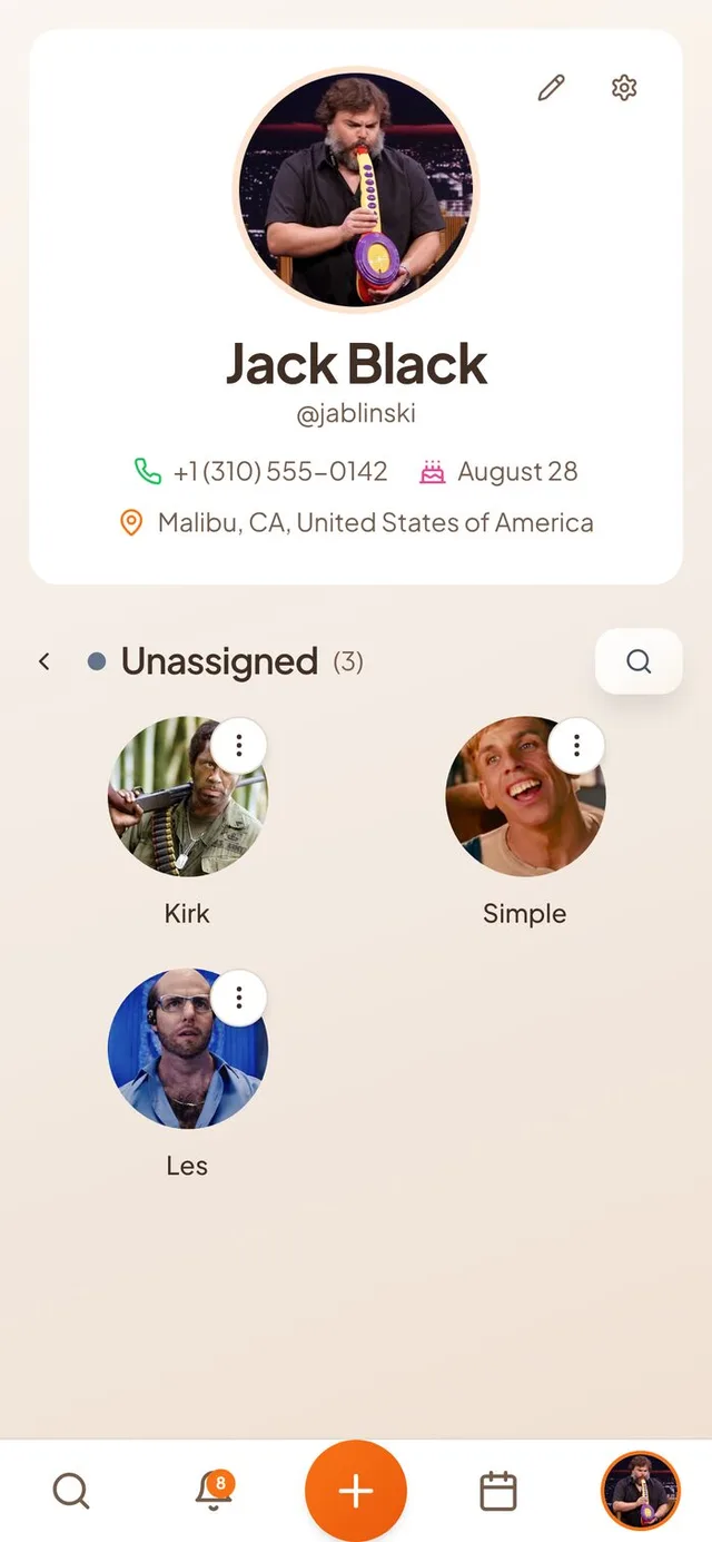
Choose your contacts
Connect contacts no longer pulls in your whole address book at once.
- A real contact picker. You now see your phone contacts in a list with search, and tick only the people you want. Contacts you already added are marked “Added”.
- See who is on Conmigo. Contacts who already use Conmigo carry an “On Conmigo” badge. Choosing them sends a friend request, and the others are saved as contacts.
- Invite by text. For people not on Conmigo, you can choose to draft a text message inviting them.
- Matches by email too. Contacts are now matched to Conmigo accounts by email as well as phone number, so more of your friends are recognised.
- Protected lookup. Checking contacts against Conmigo accounts is now limited in how often and how many you can check at once, so nobody can scan for who has an account.
A tidier Who page
Your profile and your people look right on a phone.
- Home address stays inside your card. A long address now shortens neatly with an ellipsis instead of spilling outside your profile card.
- Friend photos show on iPhone. Groups in My people showed a “?” in place of photos on iPhone. They now show the real photo, or initials when there is none.
Clearer sharing and buttons
Easier to read in light and dark mode.
- Share calendar fits your phone. Long email addresses are shortened so the Selected label and the Share button are no longer cut off.
- Bolder checkmarks. The tick in a checked box is larger and easier to see.
- Stronger orange buttons. Orange buttons are a little deeper, so the white text on them is easier to read.
- Conmigo logo in dark mode. The wordmark at the top of the phone screens turns white in dark mode so you can still read it.
Sign-in and welcome
New people get the right first steps.
- Welcome after Google sign-in. New people who sign in with Google now see the first-time welcome that asks them to connect their calendar. Before, only email sign-ups saw it.
- Timezone question is readable. When your device is in a different timezone, the message now sits above two buttons, “Keep” on the left and “Use” on the right. Before, the words were squeezed into a narrow column.
Smaller improvements
A few more fixes.
- A new Feedback button sits under Buy me a coffee and opens our Discord.
- The profile panel on computers is now wider, so it no longer gets cut off.
- The public invite page no longer has a logo overlapping the cover photo.
- Orange status dots for attendees are a little deeper in colour.